The care they deserve
Designing care to feel like care.
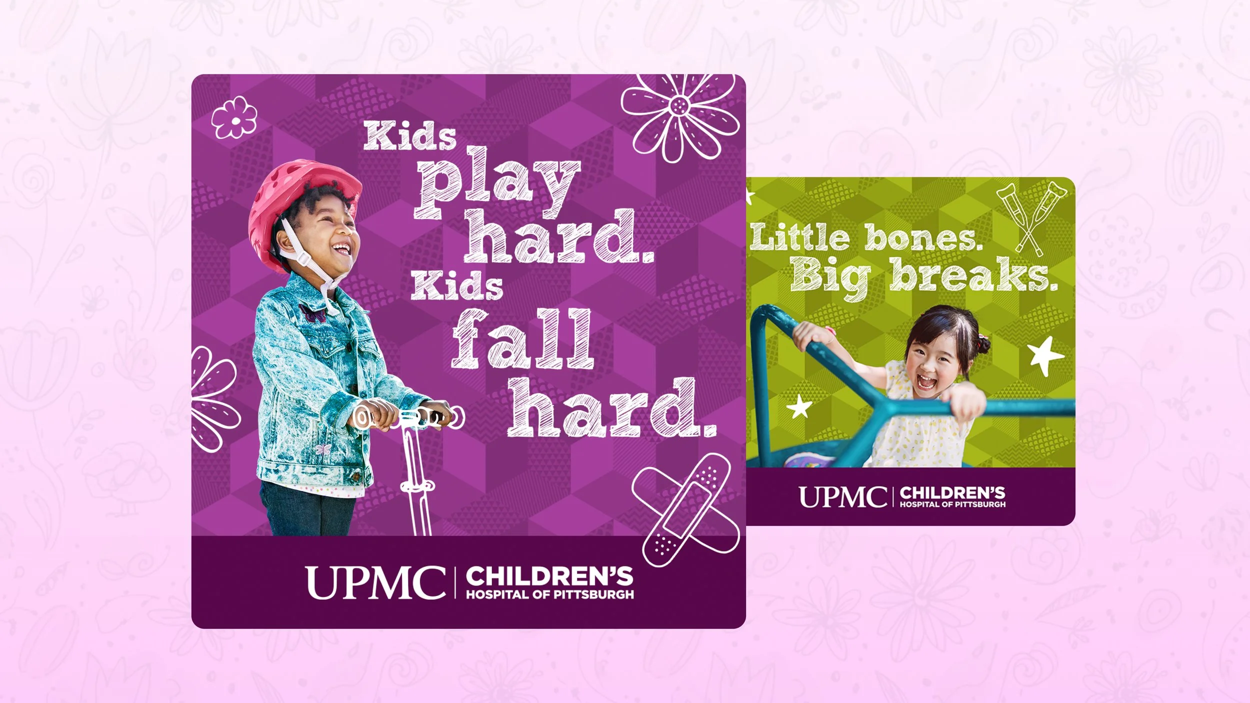
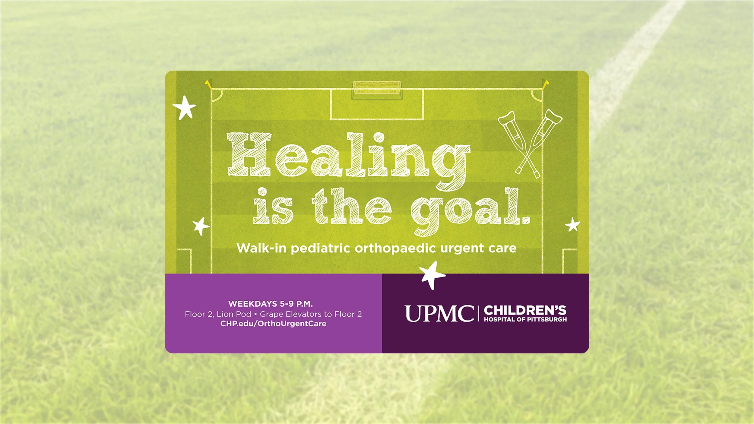
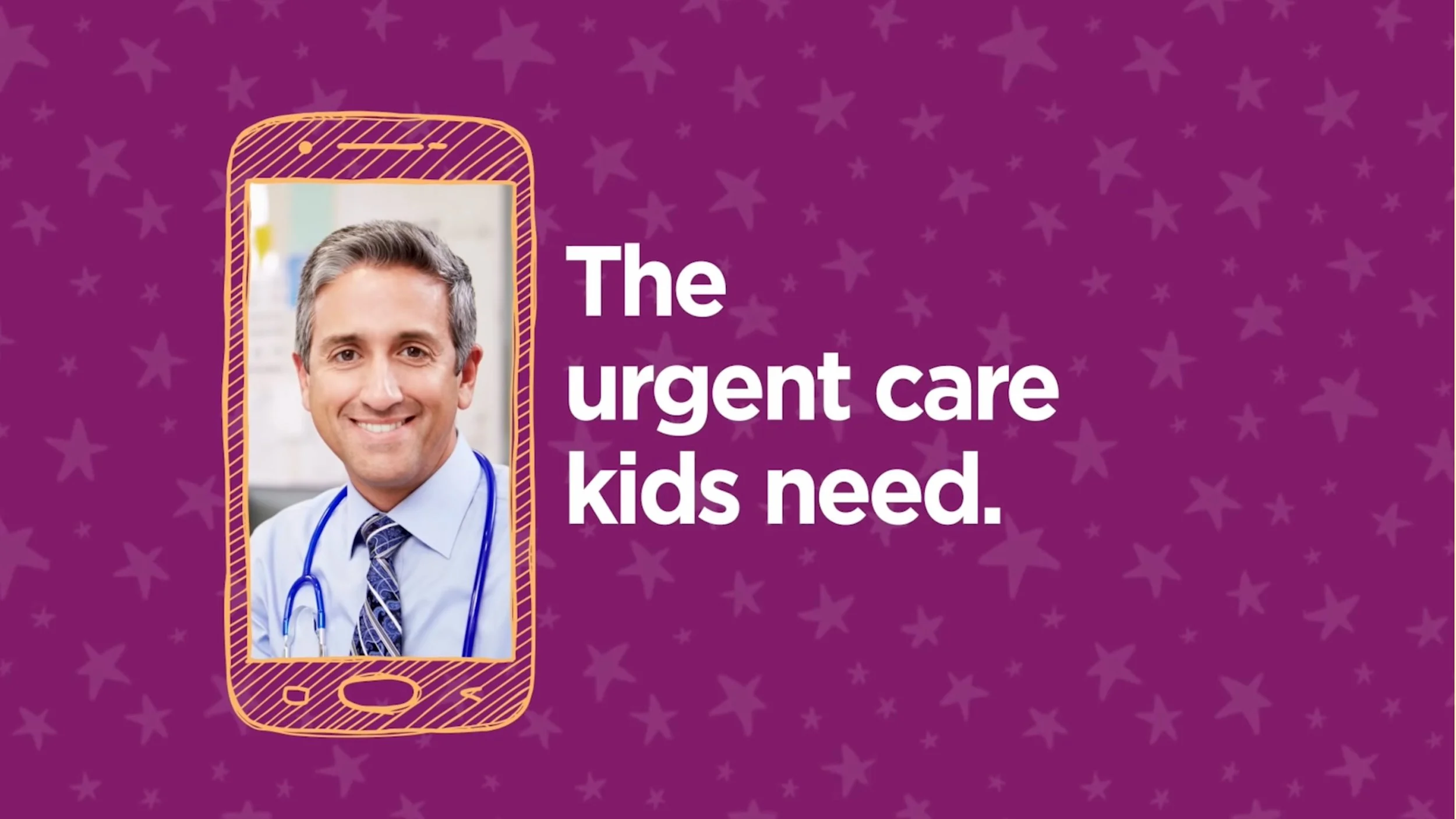
As Art Director, I partnered with a leading children’s hospital to refresh its visual identity so it reflected what families actually experience there: warmth, optimism, and real expertise. I built an iconography system that could scale across print and digital—soft shapes, approachable line work, and kid-friendly moments that kept communications uplifting without losing clarity for parents and caregivers.
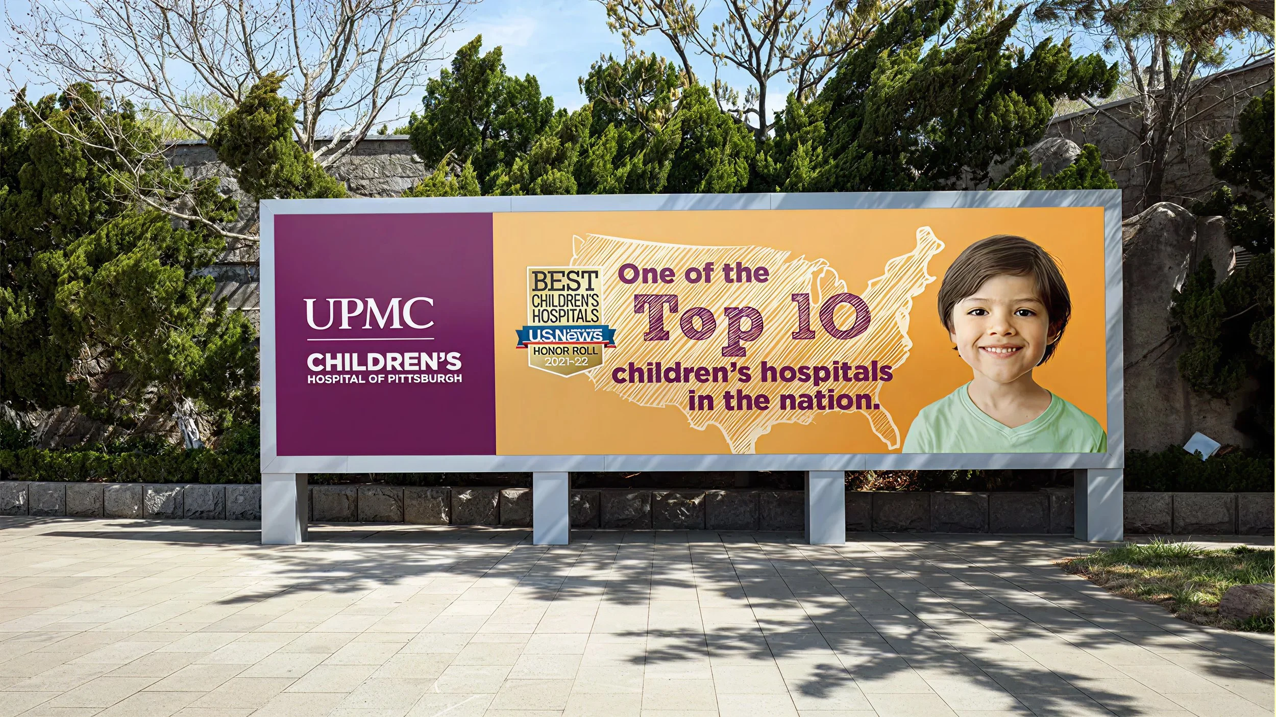
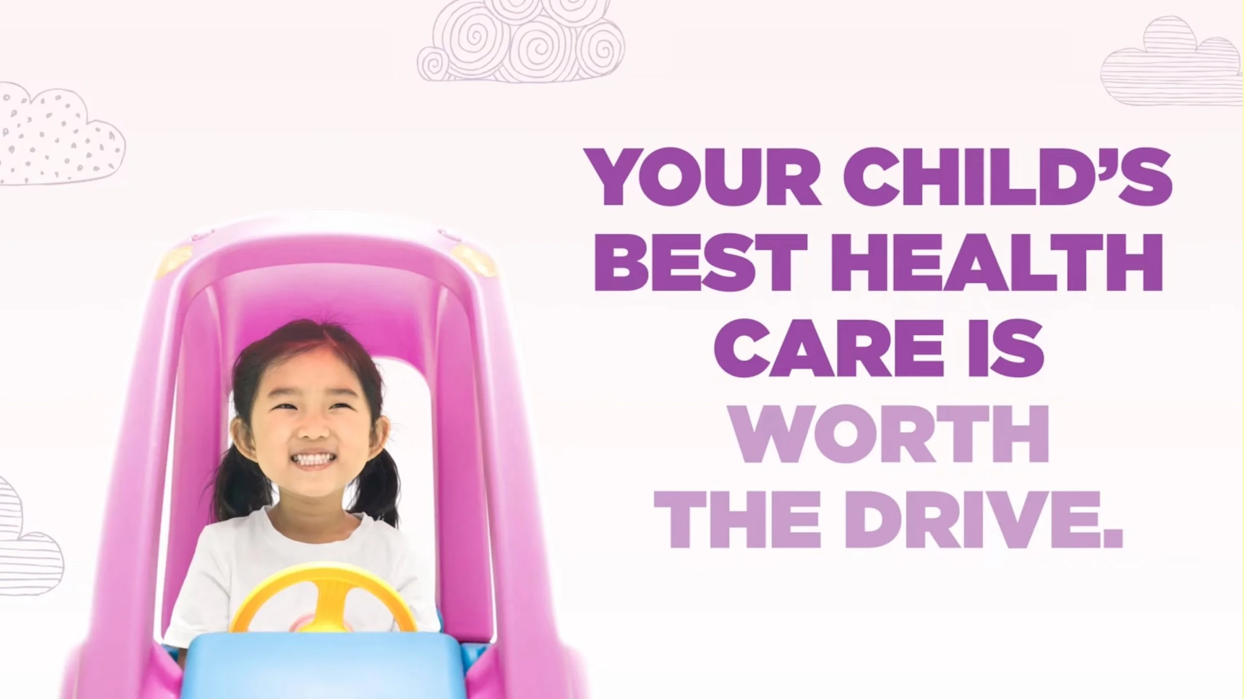
Alongside the identity refresh, I led multi-channel campaign work across social, digital, and broadcast—concepting copy, designing assets, and directing video for both social and TV spots. One highlight was a Top 10 Children’s Hospital campaign celebrating the hospital’s national ranking: the digital and social rollout drove a 25% lift in landing page traffic, boosting community pride and visibility around the hospital’s accomplishments.
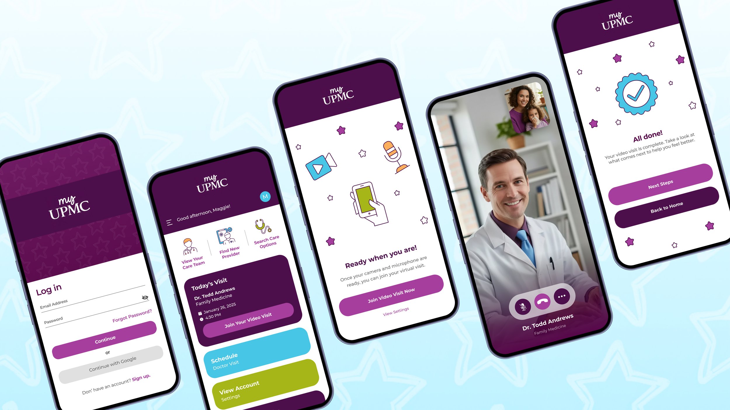
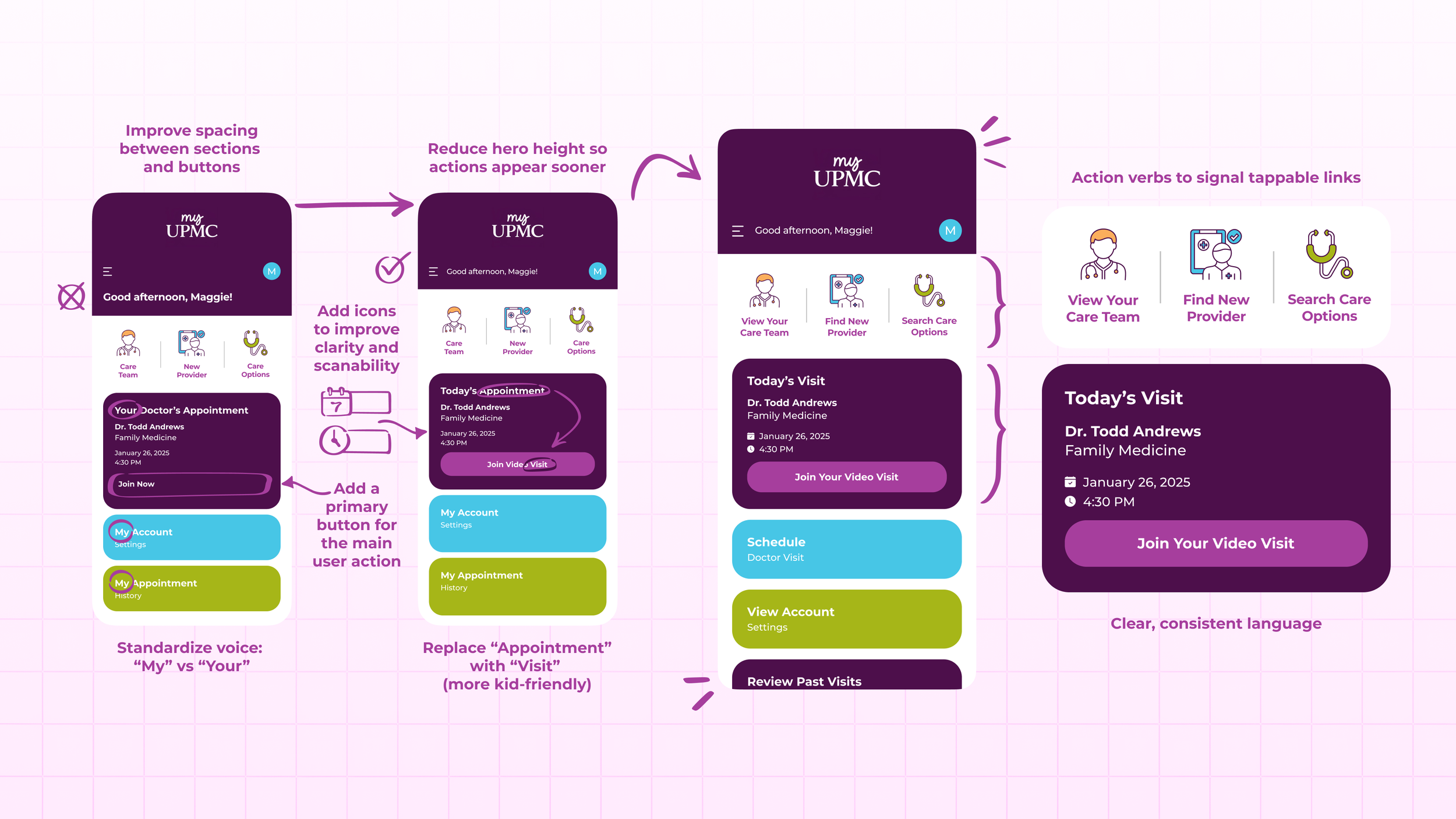
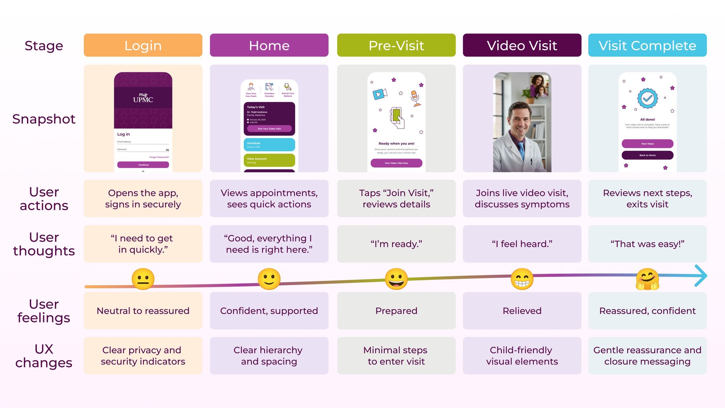
To extend the brand into everyday patient moments, I also redesigned the UI and flow for appointment card reminders—improving hierarchy, clarity, and calls-to-action so patients could quickly confirm details and access scheduled care with fewer steps. Throughout the work, I kept the tone intentional: compassionate enough for families, structured enough for stakeholders, and consistent across both marketing and product touchpoints—communicating joy, safety, and clinical excellence within one cohesive system.
End result: a pediatric-forward brand language that was emotionally resonant, easy to apply, and ready for future campaigns.