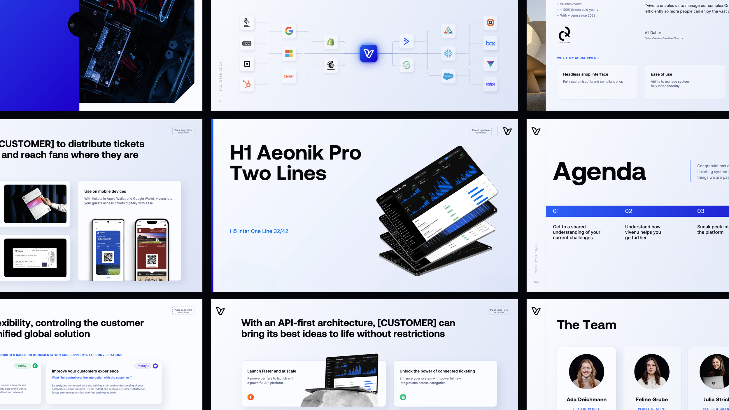
Scaling the brand to match the momentum
This rebrand was about giving a fast-growing tech team the kind of visual system their business had already earned—modern, flexible, and ready for the next stage.
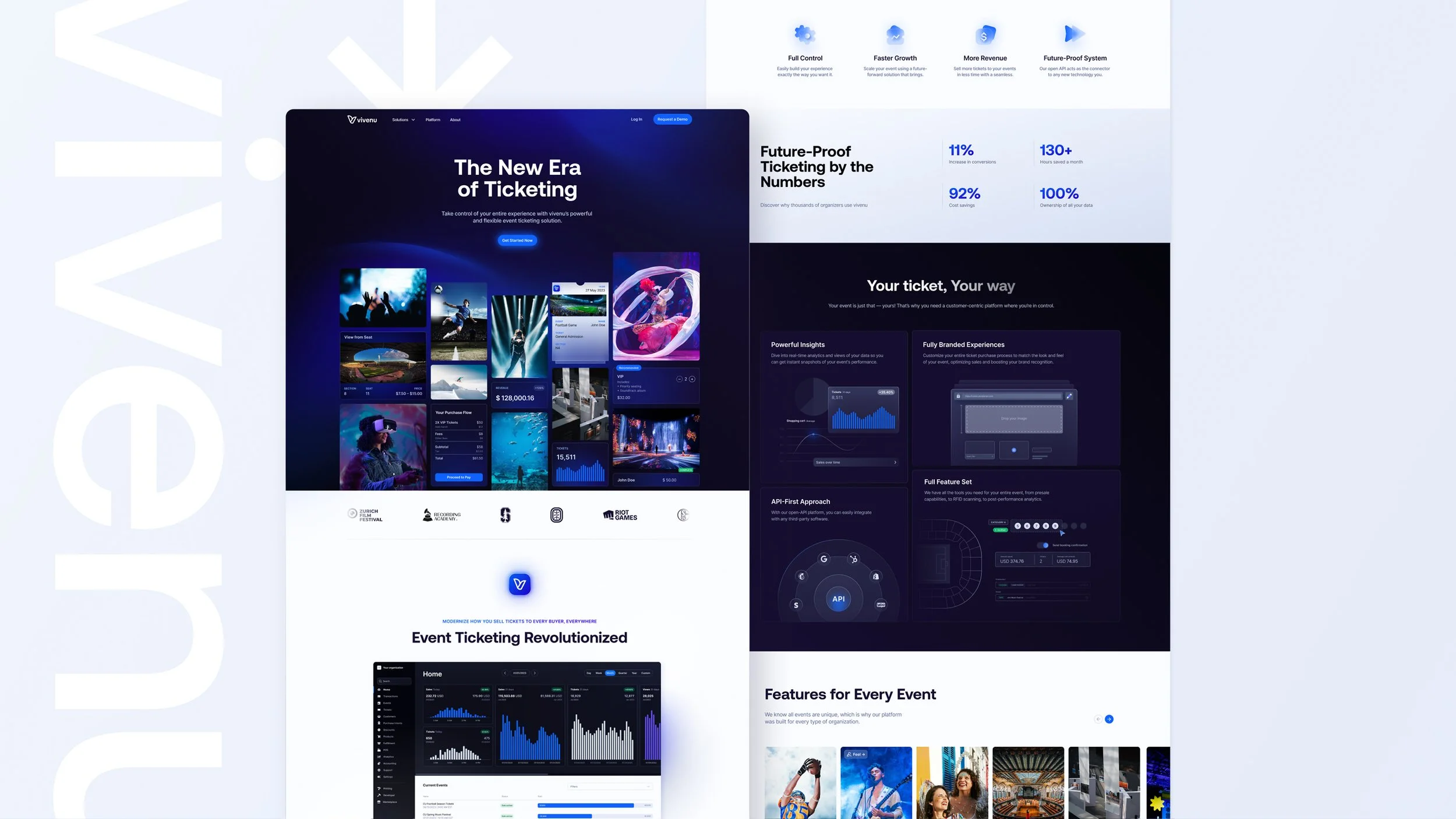
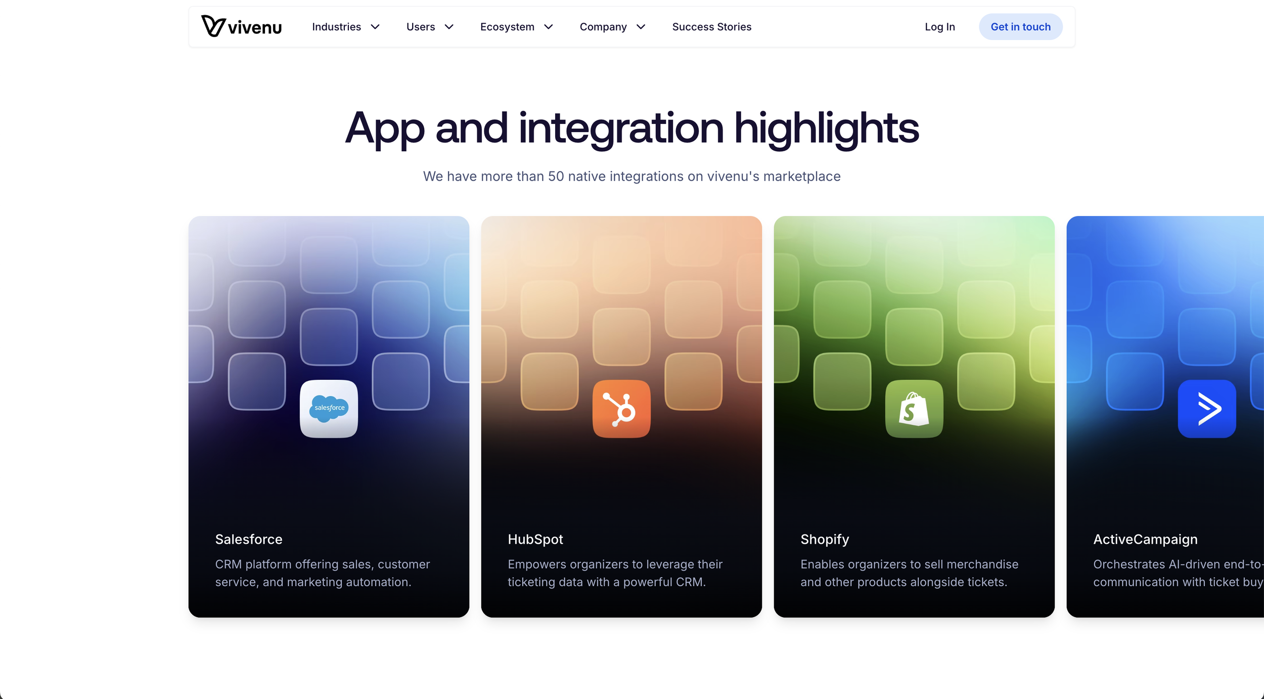
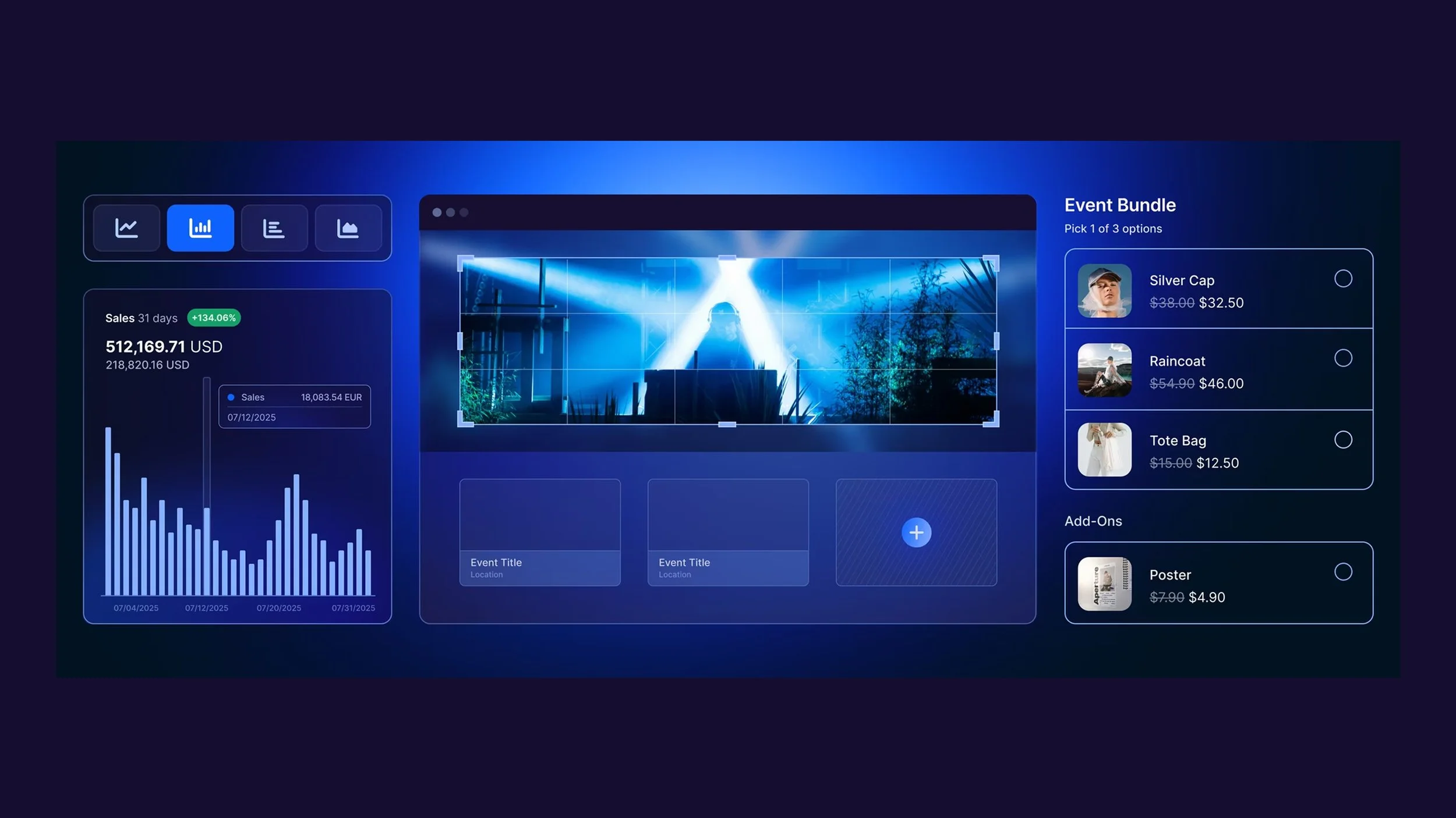
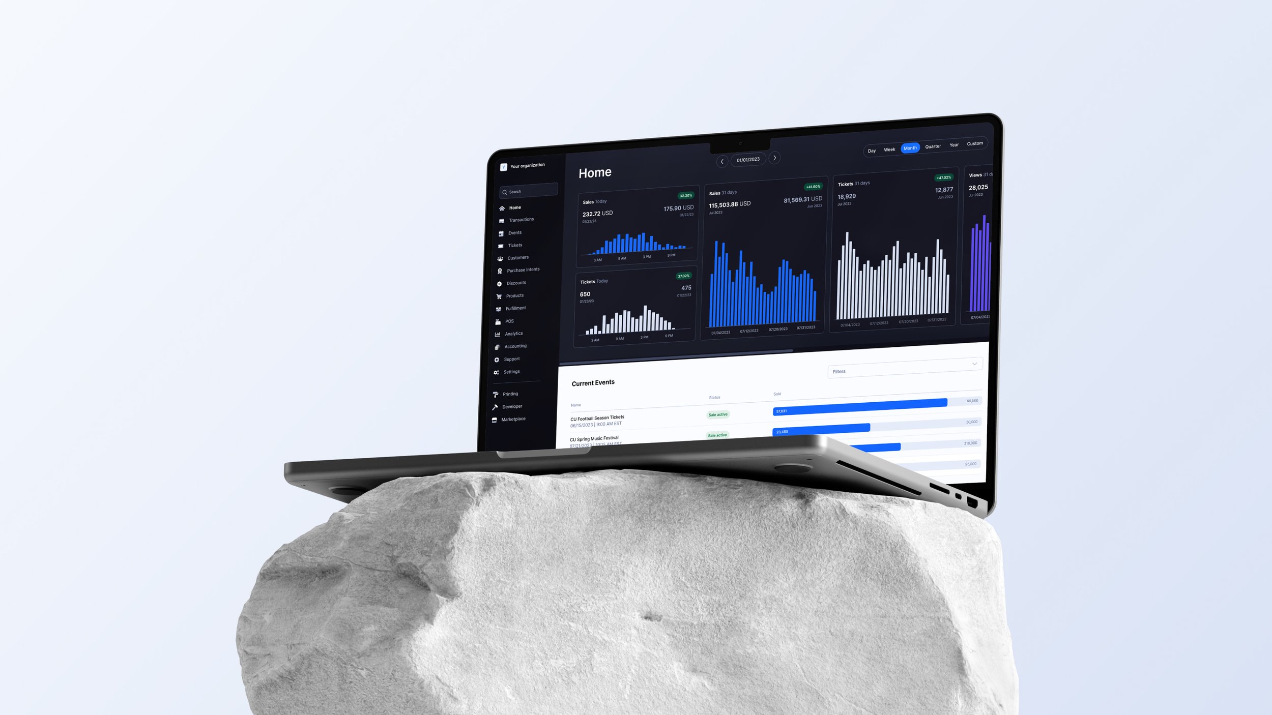
The brief was simple but ambitious: make the updated brand feel real—on the website, in campaigns, and anywhere prospects met the company. As Design Manager for the rebrand, I set the visual direction and translated it into a working product and UI system. In Figma, I built component libraries, tokens, and page templates, then documented standards for color, type, imagery, and motion so the experience stayed consistent across pages and teams. Accessibility was built into the foundation from day one (contrast, type scale, tap targets, hierarchy) so inclusive decisions were the default, not an afterthought.
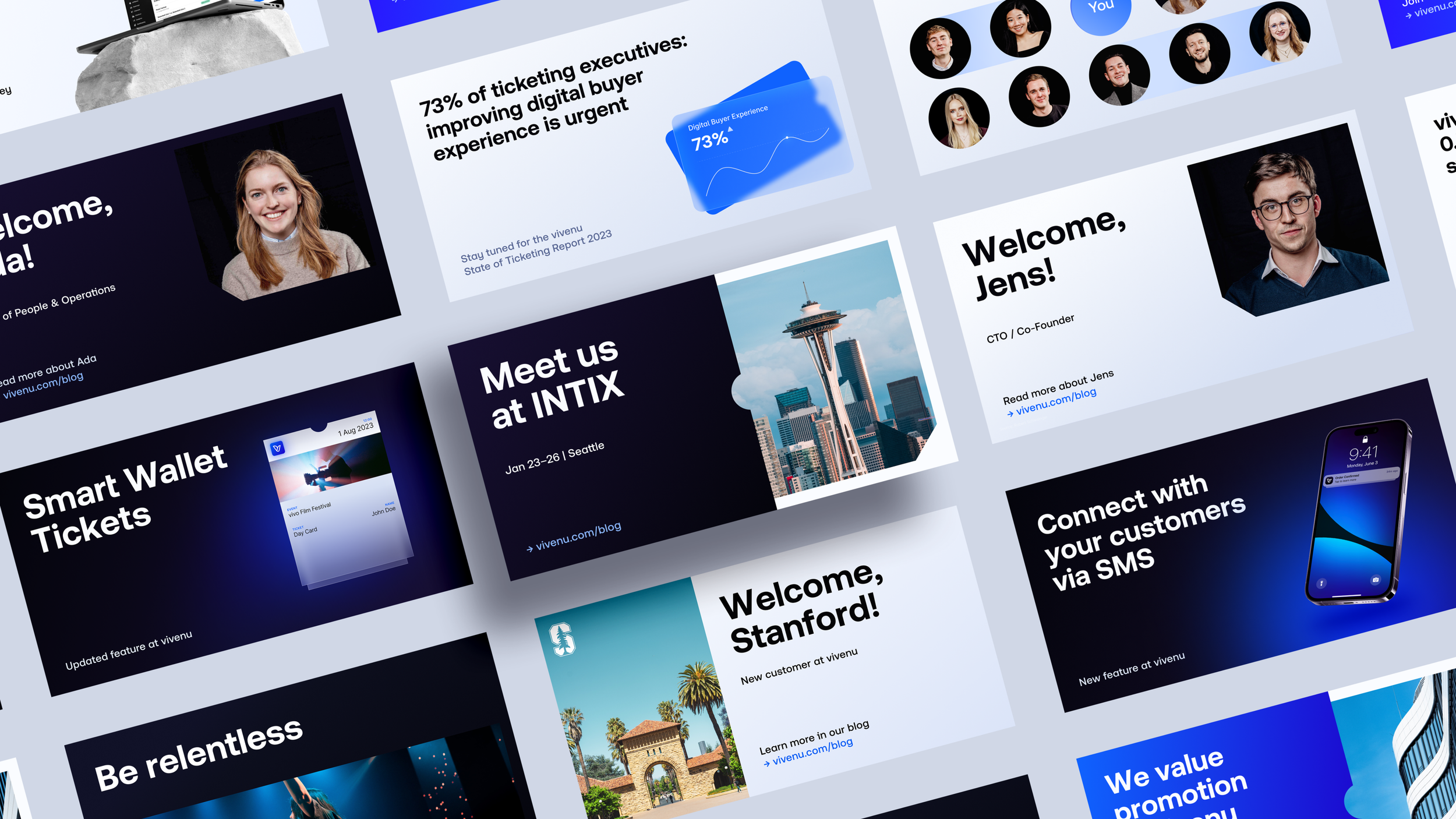
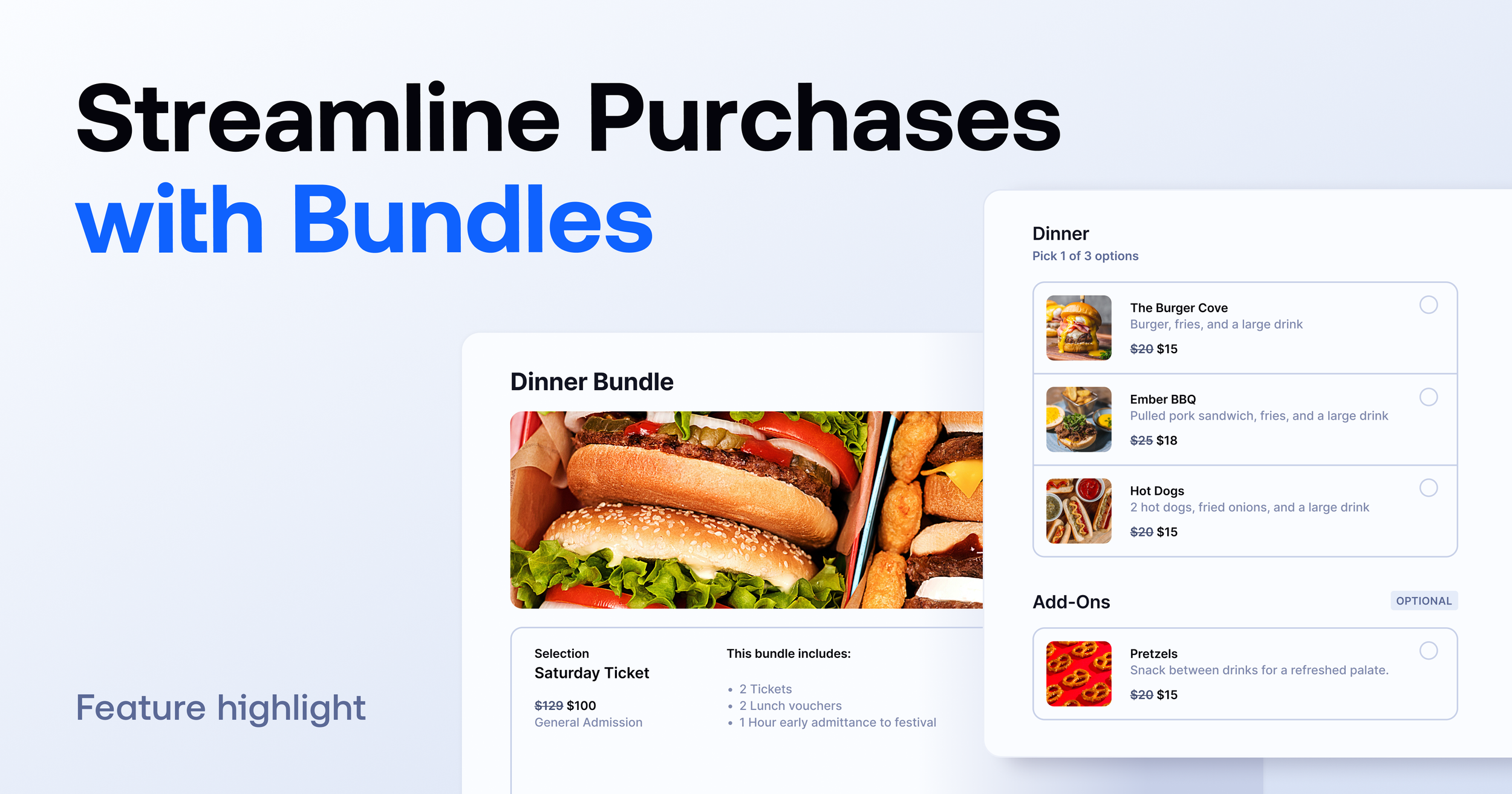
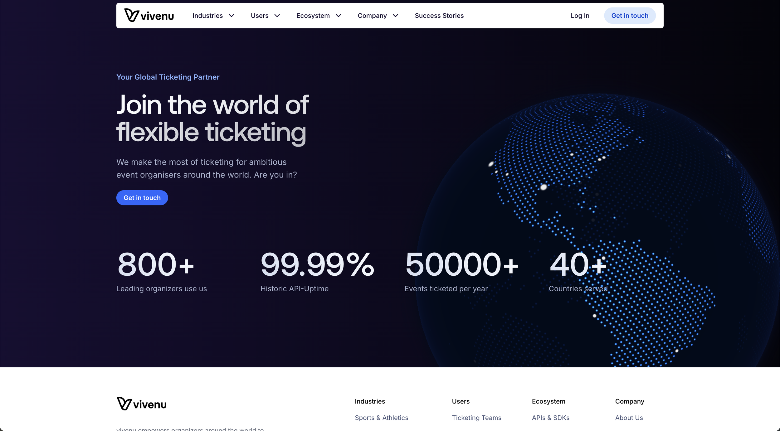
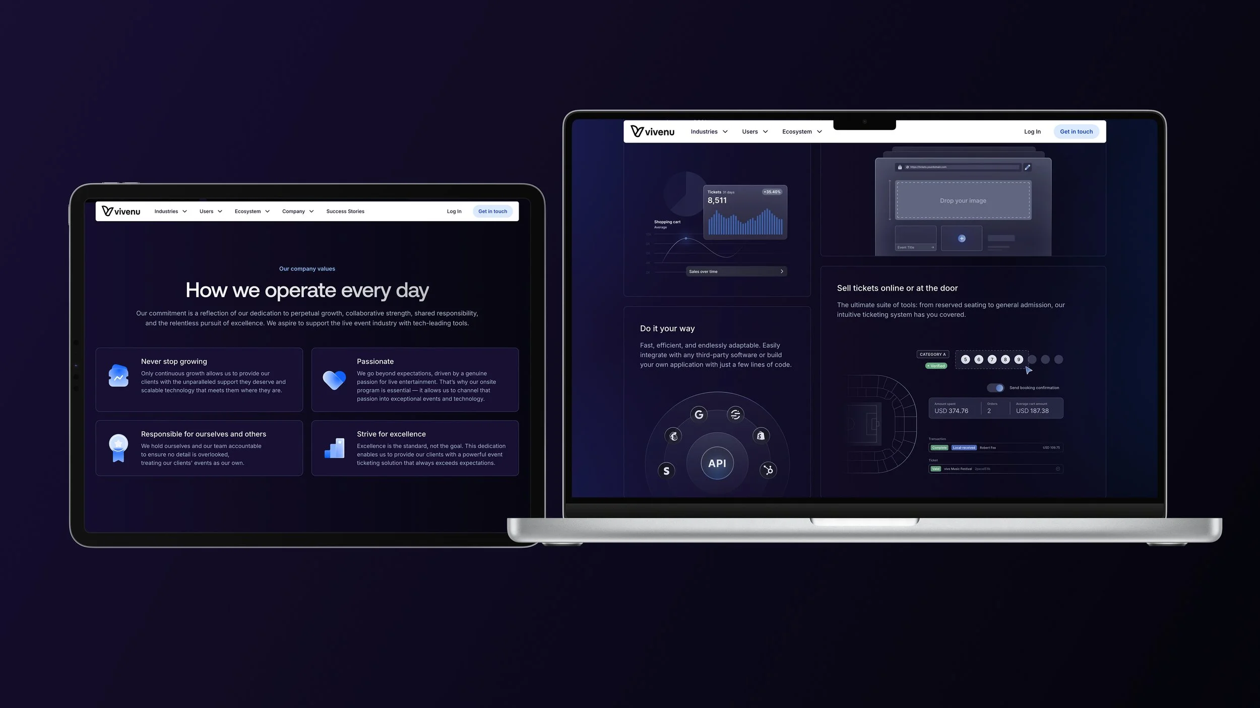
From there, it was a close partnership across marketing, leadership, and product/engineering to bring the system to life. We designed and shipped a custom website experience that reflected the brand story and supported key user journeys, then extended the system into campaign, social, and video toolkits for fast iteration. I organized files for speed—clear naming, workflow-based folders, and practical handoff notes—and ran quick trainings so internal teams could maintain and extend the system without needing a designer on every request.
The payoff came quickly: we produced 100+ on-brand assets in roughly three months, increased site traffic by +45%, improved CTA performance by +18%, and grew social audiences by +12%. Most importantly, the rebrand became a scalable product ecosystem—consistent UI patterns, clearer user paths, and a system the business could confidently build on.
Result: a scalable brand and web system the internal team could keep growing on their own.
