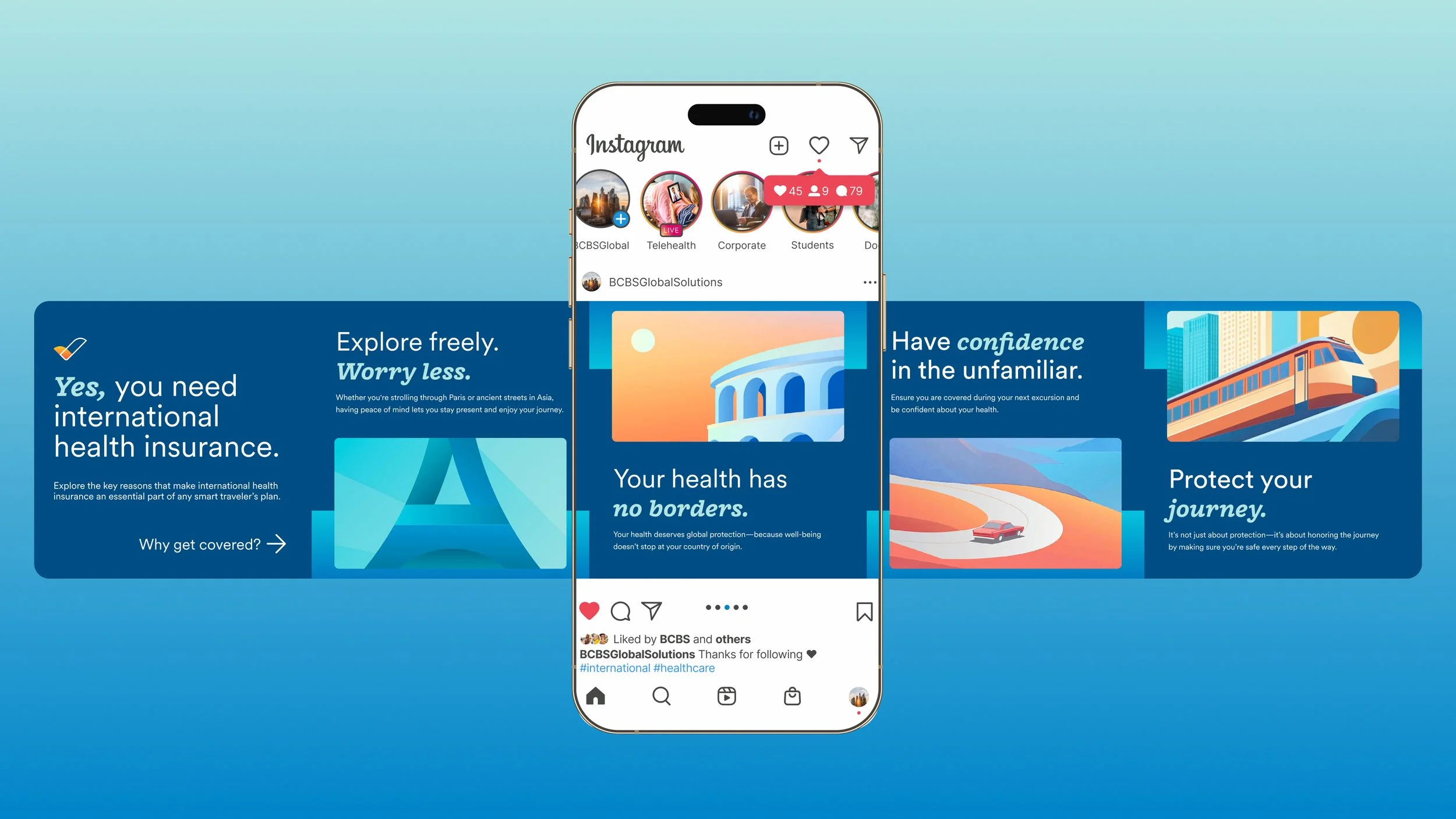
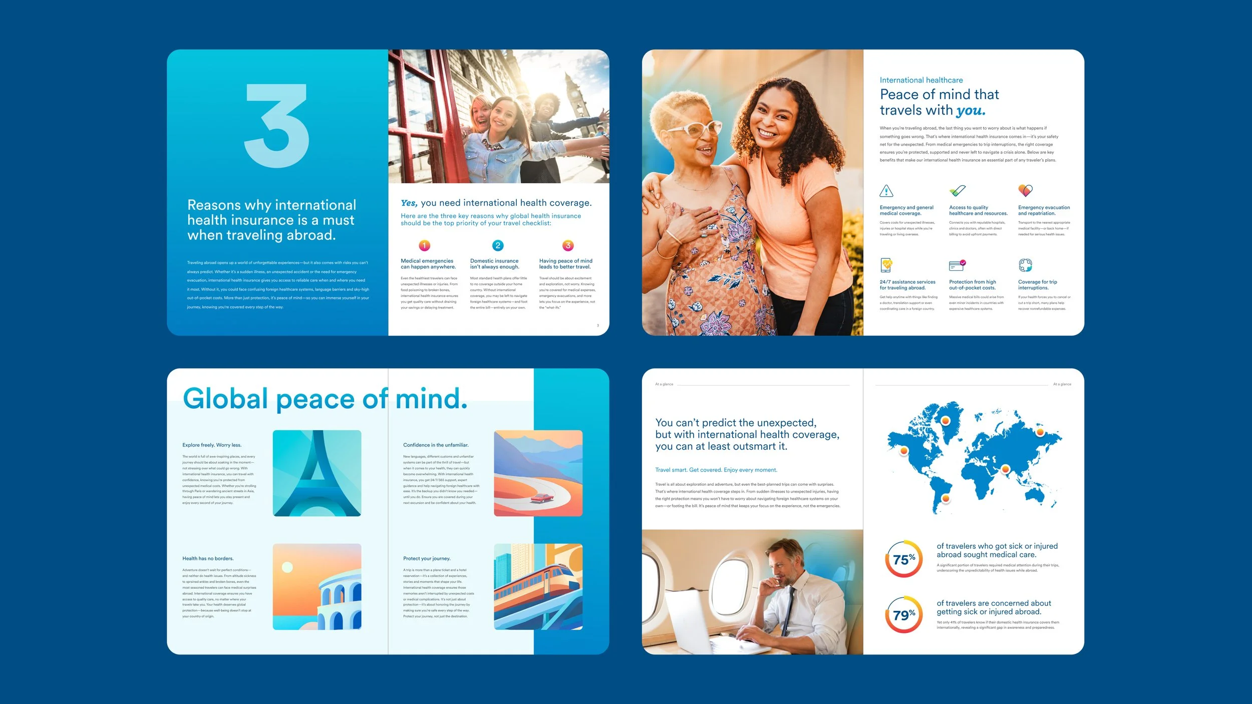
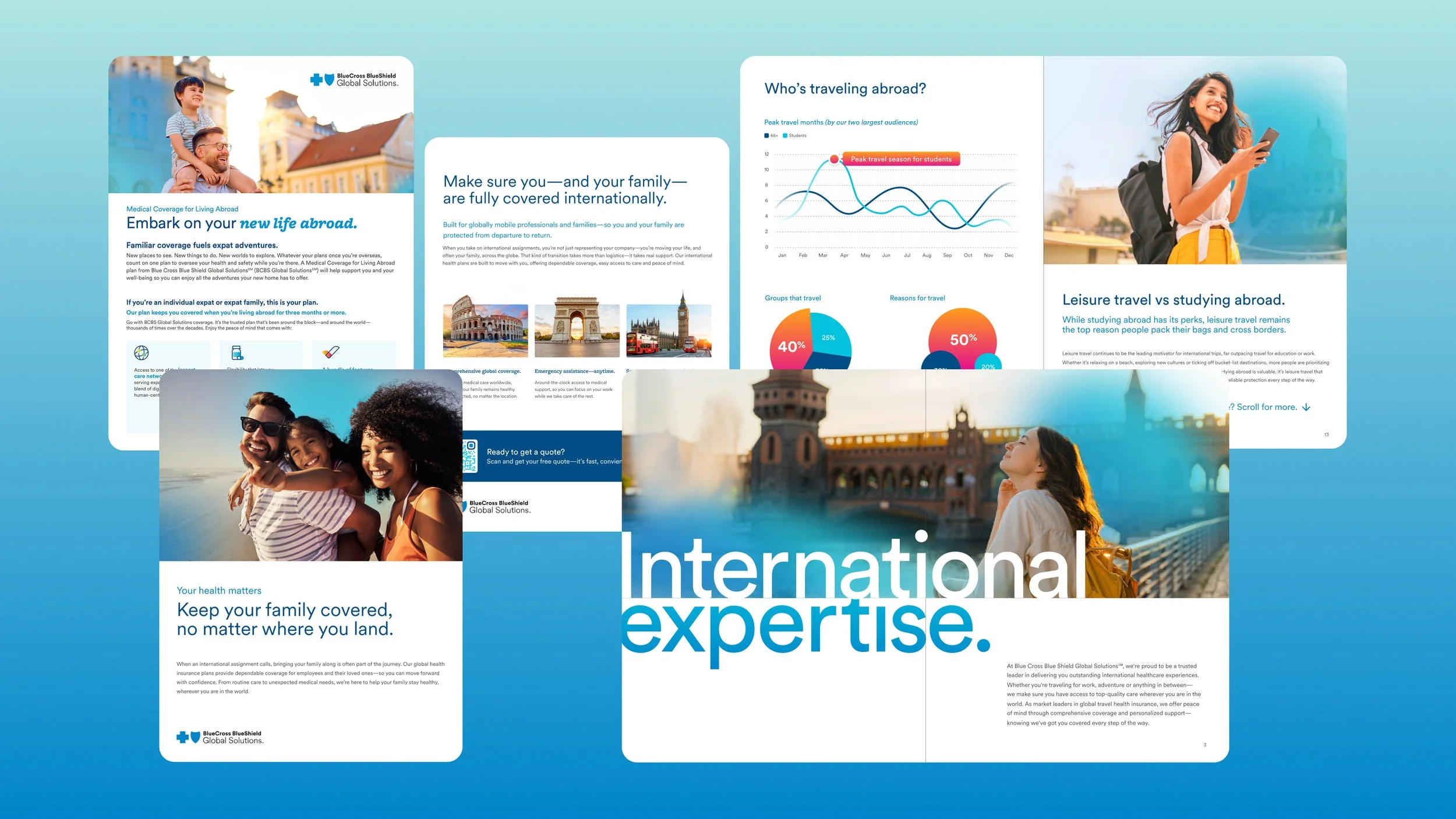
One brand, many journeys
This rebrand was about more than new visuals—it was about giving a global organization one clear story to tell.
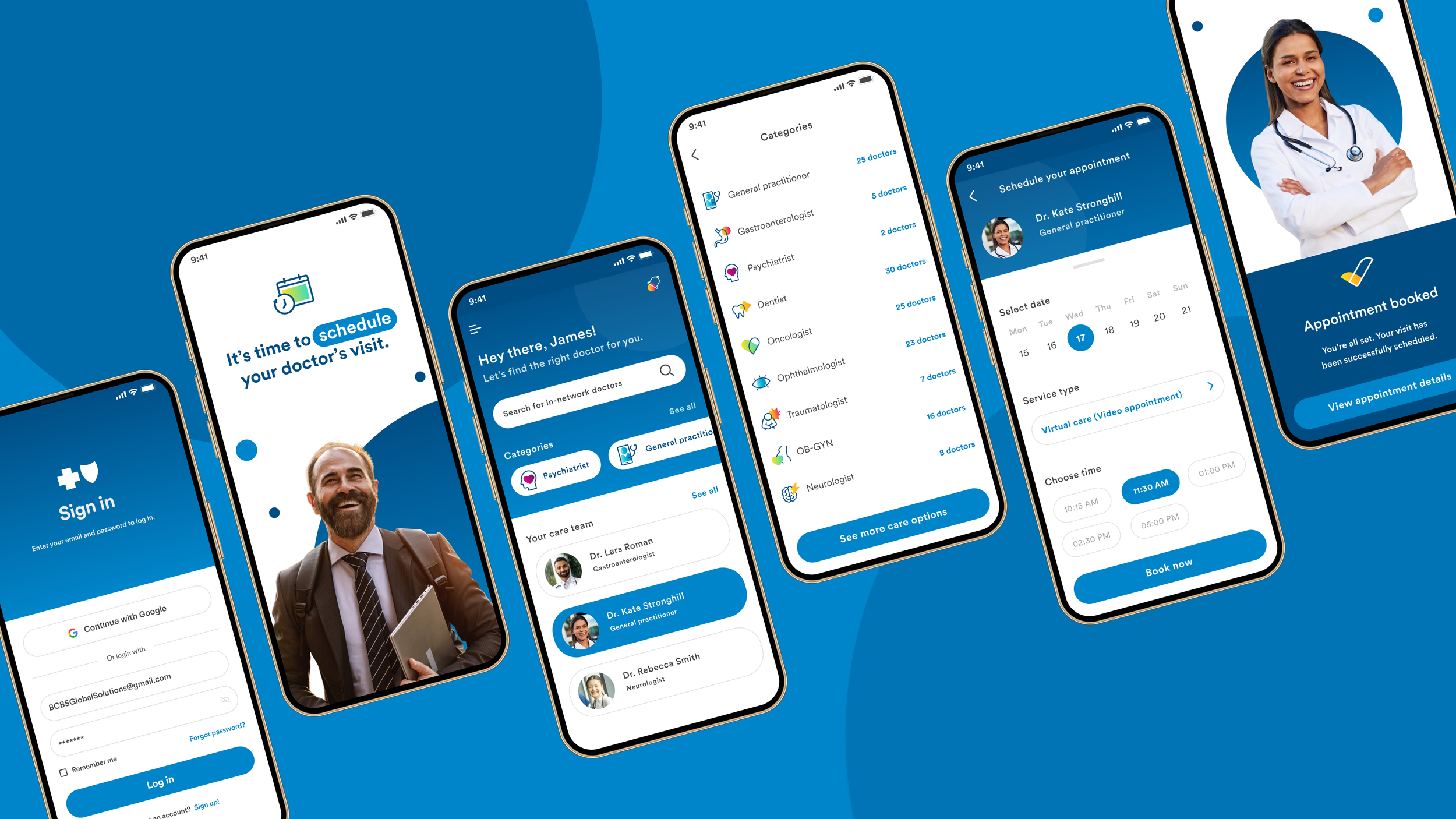
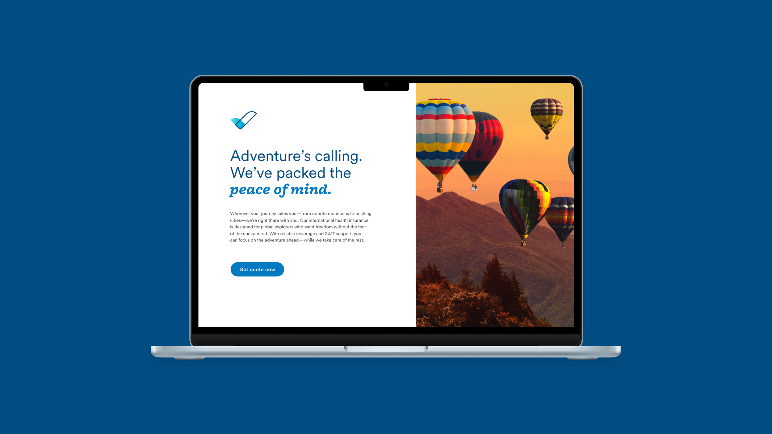
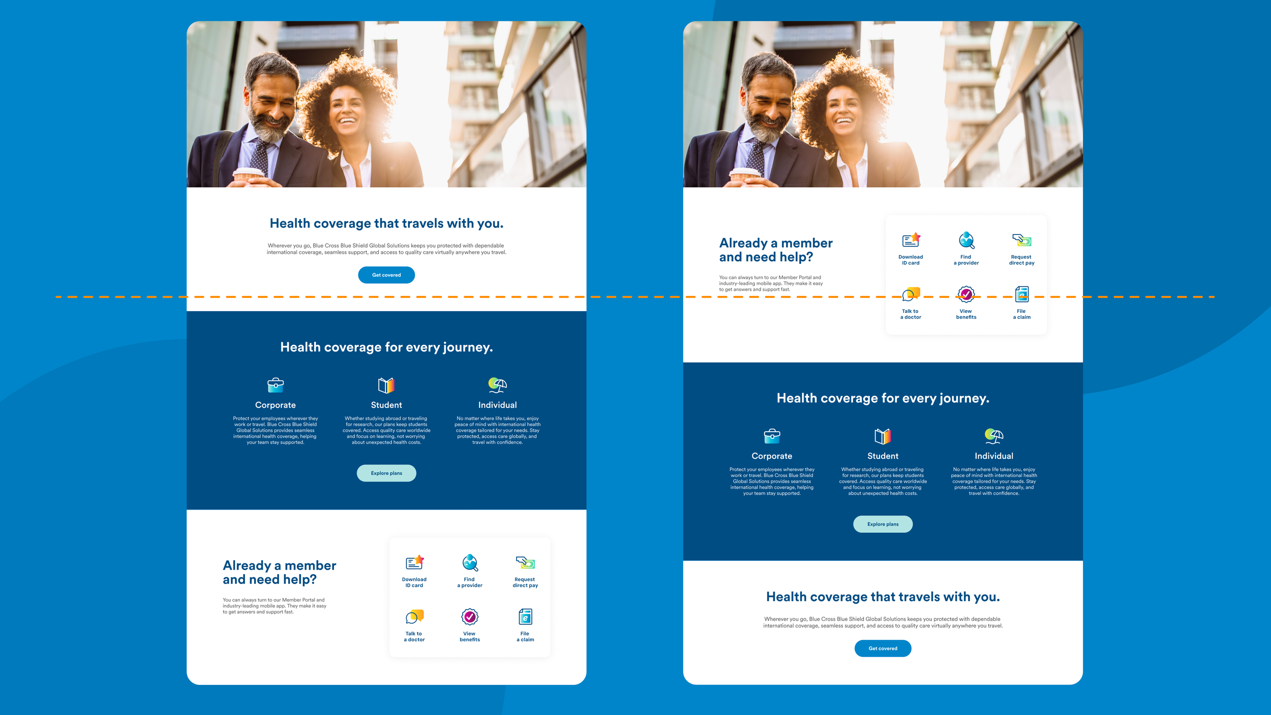
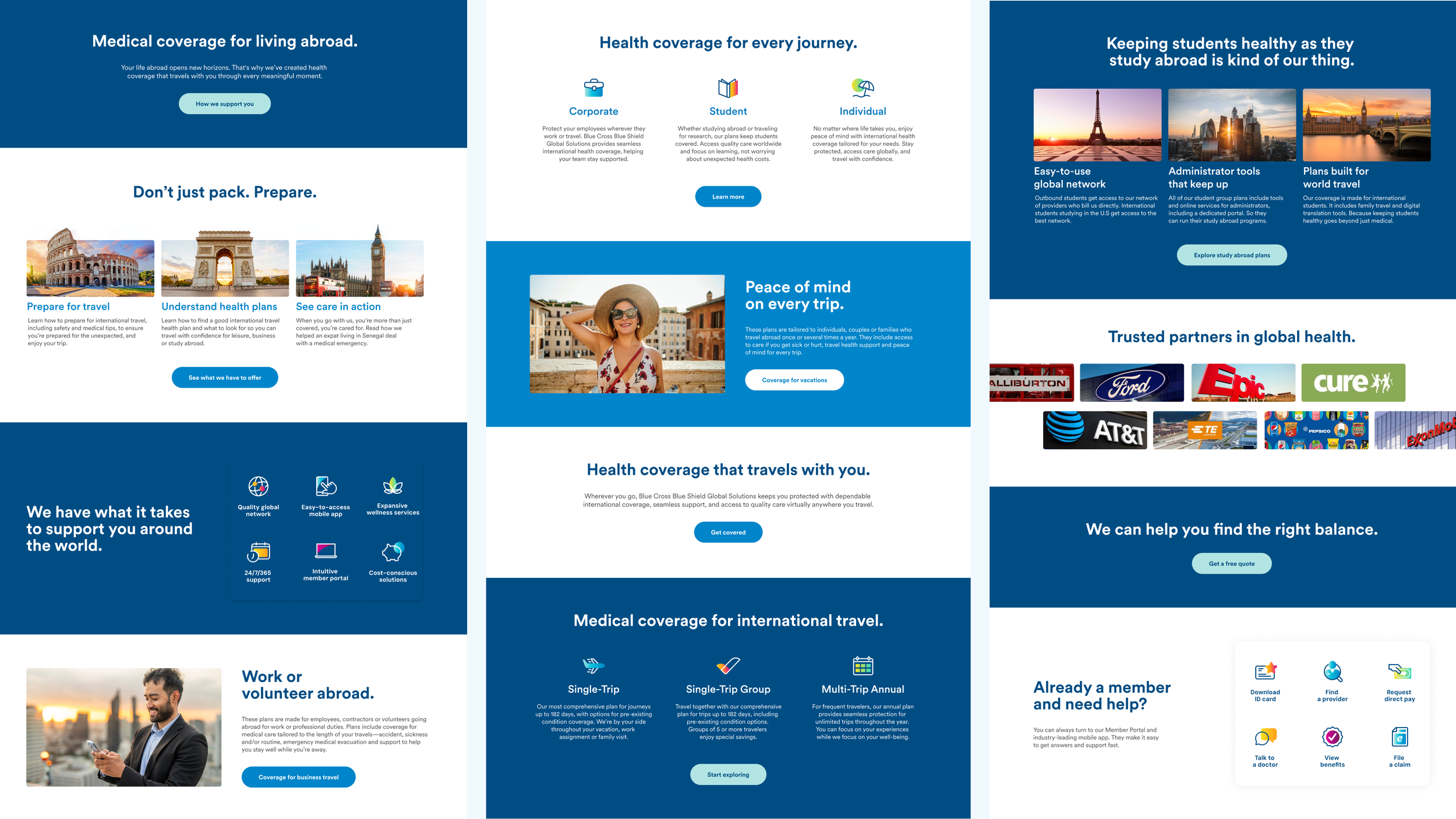
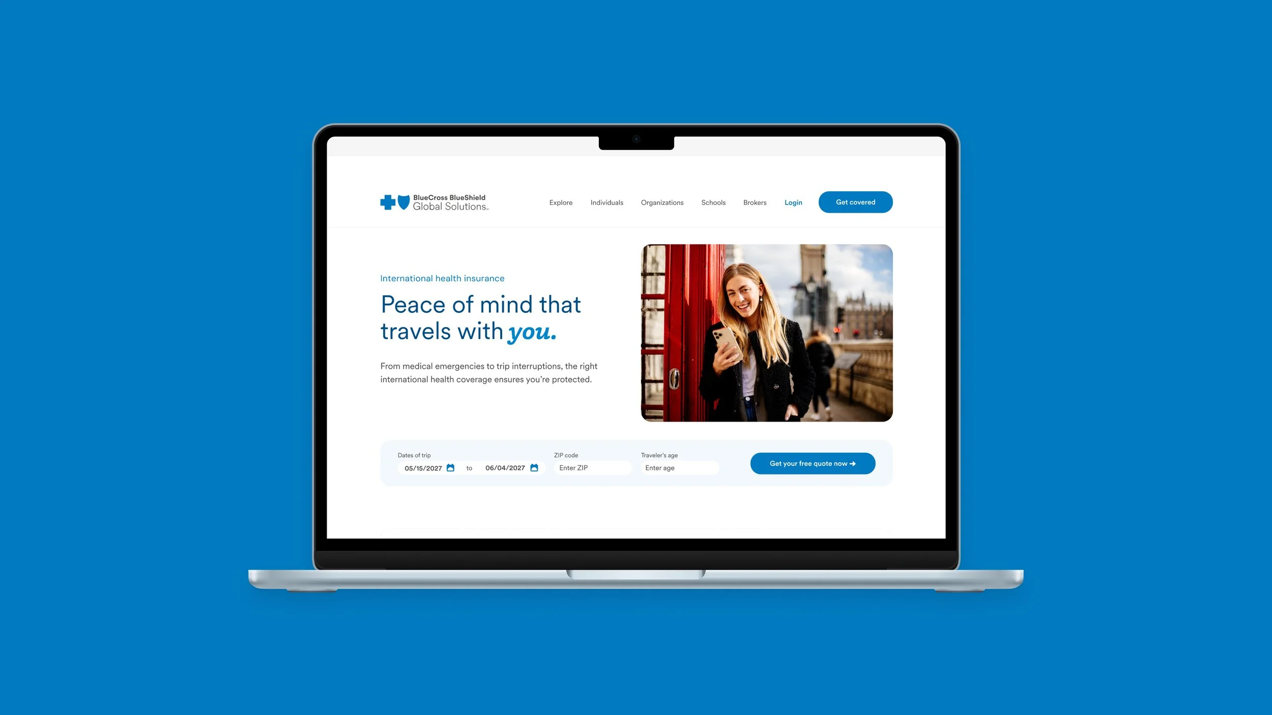
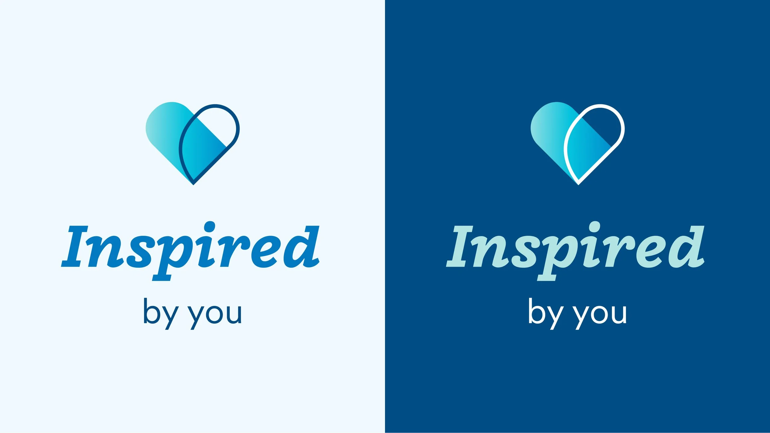
We unified a complex brand architecture into a single, modern identity so customers, partners, and members experienced one clear story—then carried that system into our website UI and product experience. As Art Director, I set the creative direction and authored the core style guide (color, type, imagery, iconography, and plain-language voice cues). I embedded accessibility from the start with WCAG-minded guidance for contrast, type scale, and component usage, and partnered with web/product stakeholders to translate brand principles into practical UI standards.
In Figma, I built a scalable, component-based design system—tokens, components, patterns, and page templates—so the website could ship consistently and evolve without rework. I established naming conventions, library organization, and governance to keep assets searchable, reusable, and aligned across design and development, while ensuring the system remained flexible for campaigns and content updates.
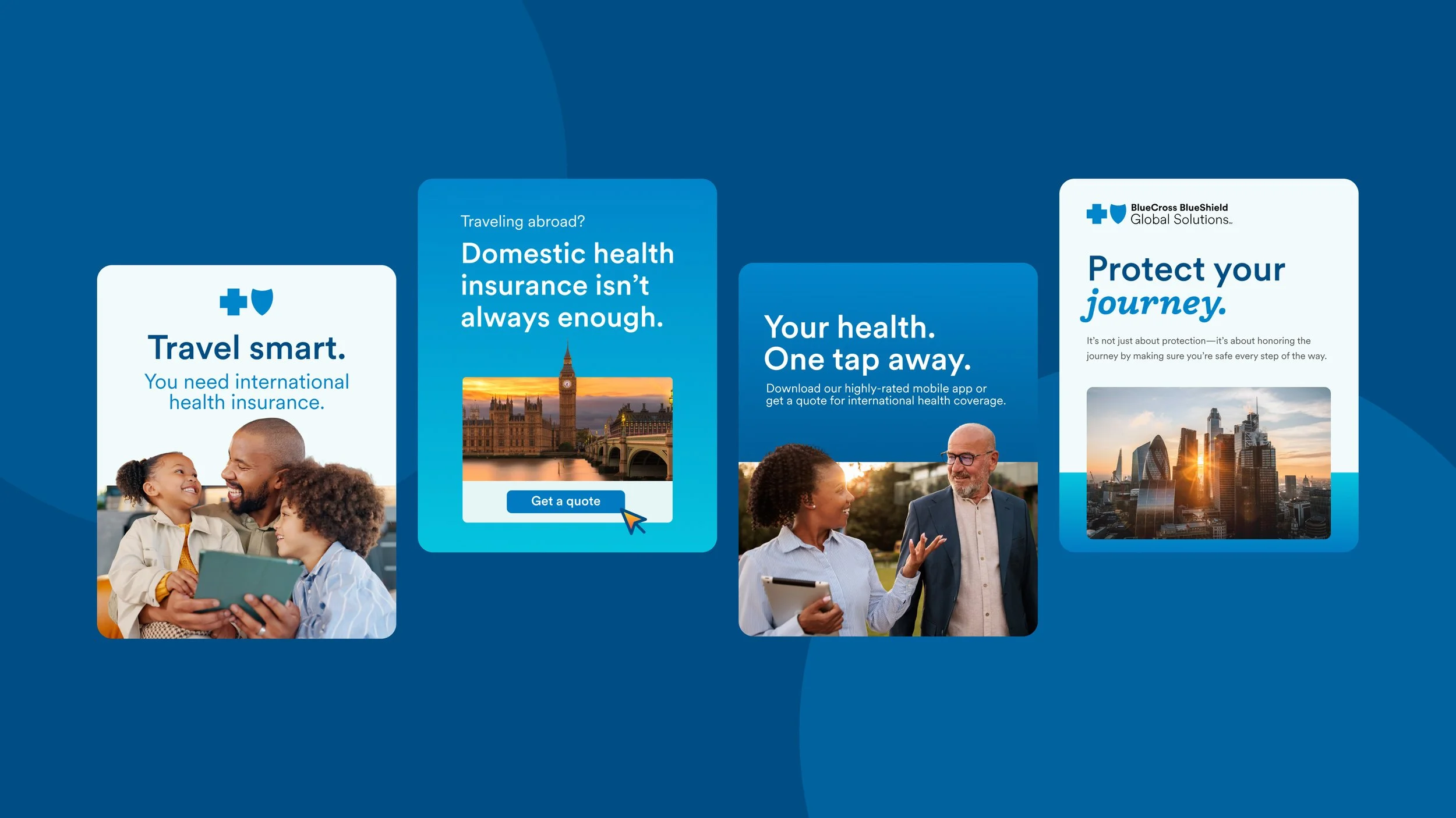
With that foundation in place, our hybrid team delivered across web, print, partner kits, and enterprise sales. We shipped 140+ launch deliverables in roughly two months, rebuilt a 120-slide corporate master deck in under a week, and produced a 2,000+ icon library to support campaigns at scale. I led weekly reviews with marketing, digital, product, compliance, and project management to keep decisions moving, and refined templates so non-designers could self-serve while staying on-brand. The outcome was one consistent brand voice across touchpoints, a measurable lift in production efficiency (+40%), faster approvals with fewer revision loops, and a website UI system that supported faster iteration and more cohesive customer experiences.
We didn’t just launch a new look—we operationalized the brand so it could be maintained.